Where to Place Review Cards: A Practical Guide for Small Businesses
Find practical places for QR and NFC Review Cards, from checkout counters to service visits, with simple wording and a routine your team can follow.
Start with the customer’s situation
A Review Card can be easy to overlook when it sits among payment logos, appointment reminders, offers, and business cards. Adding another sign does not automatically make the next step clearer. The customer needs to notice the invitation at a moment when it makes sense.
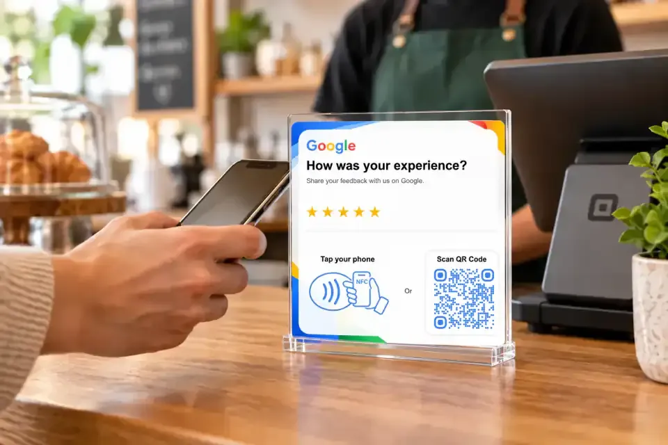
Before choosing a location, walk through a normal customer visit. When is the service finished? Where does the person pause? Are their hands full? Will they have space to use their phone without holding up a queue?
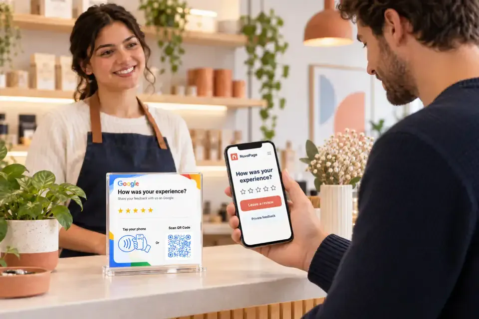
Those questions help you choose a position that fits the visit. With NuvoPage, the QR or NFC card connects that physical spot to your online destination. Thoughtful placement gives the connection a better chance of being useful.
Put the invitation after a meaningful experience
Someone entering a shop may not yet have anything useful to say about the visit. Someone collecting a completed repair has an experience to describe, but may need a moment to check the work or ask a final question first.
Place your request around the natural completion of the interaction. That might be after an appointment, at order collection, or during the handover at the end of a service visit. Let the customer finish their immediate task before drawing attention to the card.
Use a consistent invitation across customers. The timing should follow the service journey, rather than depend on whether staff expect a favourable rating. A review request works best as an ordinary opportunity to respond, not a test of how pleased someone appears.
Match placement to the business
Different settings call for different arrangements. Use these examples as starting points, then adjust them to the way people actually move through your space.
| Business setting | Possible placement | Detail to consider |
|---|---|---|
| Retail shop | Beside the completed-purchase area | Leave room beyond the payment terminal |
| Salon or studio | Reception desk after the appointment | Keep the card visible during checkout |
| Café or restaurant | Bill holder or a clear checkout position | Avoid mixing the review code with ordering instructions |
| Repair business | Collection desk | Allow time for the handover conversation |
| Mobile service | A card presented after the work is completed | Let the customer open the link on their own phone |
| Takeaway business | Printed card inside the bag | Invite a review after the customer has tried the order |
You do not need every possible placement. Begin with the one that best matches the completion of your service. A single obvious invitation can be easier to understand than several signs competing for attention.
Give the card one clear job
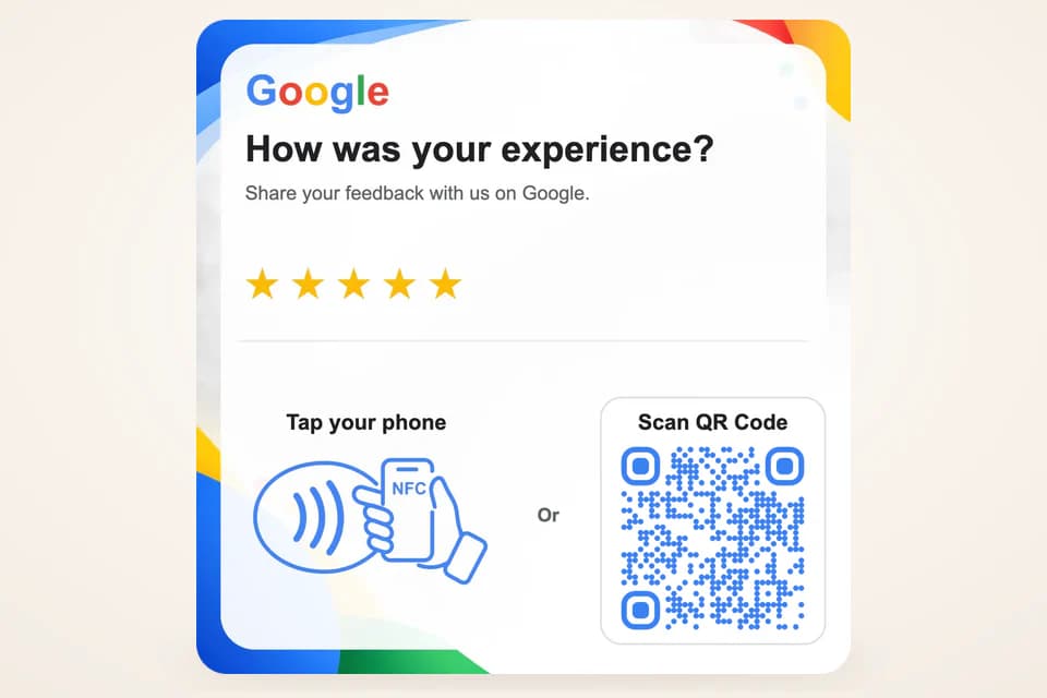
Design the review side of the card around three things: your business name, the invitation, and the action. Customers should recognise the business and understand the destination without reading a paragraph.
For example, “Share your experience” can sit above the QR code, with “Scan or tap to open our review page” below it when NFC is available. Keep additional wording short enough to read while standing at a counter.
Avoid crowding the card with every service you offer, social media icons, and several unrelated QR codes. If you want to share a broader website, use separate material or make that choice clear on the destination page. A customer scanning a review card should not have to search through a general marketing page to find the review action.
Test the physical position, not just the image
A QR code that scans on your computer screen may behave differently after printing and placement. Check the finished card under the lighting customers will experience. Look for glare, shadows, worn surfaces, awkward angles, or objects blocking part of the code.
Keep sufficient clear space around the QR pattern and make it large enough for the intended scanning distance. Test from where a customer will stand instead of holding your phone unusually close to prove that it works.
For NFC, check the actual card in its intended holder or mounting position. Use a clearly marked tap area and try more than one phone when possible. If either method becomes unreliable, the other should remain easy to use. A short printed URL can provide an additional fallback.
Give staff a sentence they can use naturally
Your team does not need a sales script. A short invitation is enough: “If you’d like to share your experience, you can scan or tap this card.” Then allow the customer to continue at their own pace.
Explain the destination to staff so they can answer a basic question. They should know whether the card opens a public review platform directly or a NuvoPage page with clearly labelled choices. They should also know how to recognise the correct business and location on the resulting screen.
Do not make staff performance depend on securing particular ratings. Avoid asking them to select only apparently happy customers. Google’s policy prohibits selectively soliciting positive reviews, so train the team to offer the same opportunity consistently. Google Maps content policy explains the rule.
Make off-site invitations self-explanatory
A card included with an order or handed over after a home service may be opened later, without an employee nearby. Its wording needs to make sense on its own. Include the business name and a reminder of why the customer received it.
For an order insert, an invitation such as “After you’ve tried your order, we’d welcome your feedback” gives the person time to have the experience first. For a completed service, a brief thank-you can lead into the review invitation.
Avoid promises about how quickly every customer will finish. Opening the link may be quick, but writing a review takes whatever time the person chooses. For Google reviews, account sign-in is required, so a returning customer’s journey can differ from someone who is not signed in. Google’s review guidance confirms this requirement.
Keep every location connected correctly
If you operate more than one location, label your cards clearly during setup and testing. A customer visiting one branch should not accidentally reach another branch’s review destination because two similar cards were mixed up.
Keep a simple owner checklist recording the card’s physical position and intended destination. You do not need a complicated tracking project; the aim is to make replacement, relocation, and testing straightforward.
NuvoPage’s reusable links allow you to update a connected destination while keeping the printed code. After a change, test the card where it is used. Check both QR and NFC if both are present, and confirm that the page name and location still match the invitation printed on the card.
Review the experience, then improve one thing
After the card has been in use for a while, ask staff what they notice. Do customers understand it? Do they confuse it with a payment code? Is it regularly hidden behind another object? Do they have room to stop?
These observations can guide a small change even without analytics. Move the card, simplify the wording, or improve the lighting, then observe again. Changing one thing at a time makes it easier to understand what helped.
If you track visits through tools available in your setup, remember that a visit is not a published review. A person may open the page and decide to finish later or not post at all. Start with a clear destination, a practical position, and a relaxed invitation. NuvoPage Review Cards can then become a useful, ordinary part of how your business welcomes customer feedback.